Scroll for Change, Stay for Impact
Client
United Nations Human Rights Office
Industry
International Relations
My Role
Product Design Intern
Timeline
4 Months (May 2023 - Sep 2023)
Tools
Figma, Adobe Illustrator
Team
1 UX Designer,
1 Developer,
1 Writer
1 Graphic Designer
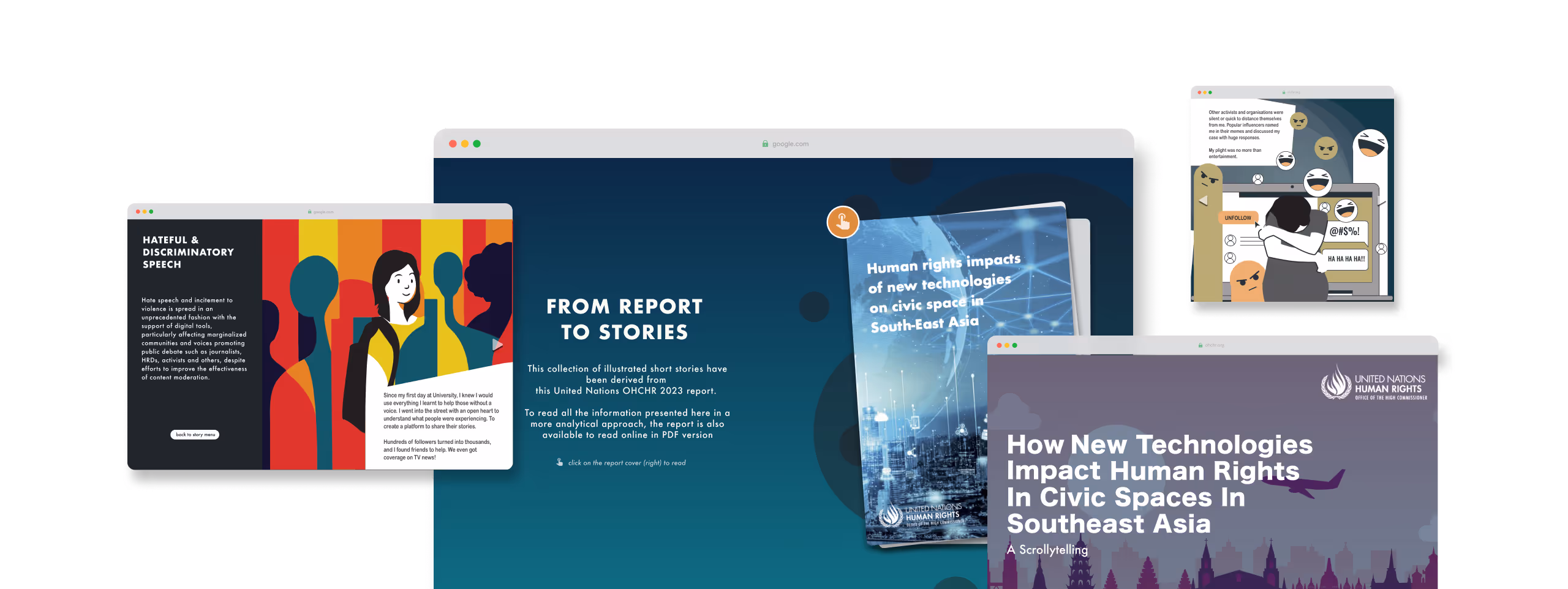
During my internship at Singaporean design consultancy Dilucidar, I designed a web-based interactive scrollytelling experience for the United Nations Office of the High Commissioner for Human Rights (UN OHCHR), Bangkok Office. I translated a dense regional report into a compelling digital narrative spotlighting six key trends in how emerging technologies impact human rights across Southeast Asia.
My role focused on designing the foundation for a narrative-first experience: creating the first iteration of the platform, which was presented to the UN OHCHR and passed to the next design team for further development.
✦. ── The Big Problem
How might we transform a dense policy report into an accessible, emotionally engaging digital narrative that mobilizes Southeast Asian youth to take grassroots action?
Southeast Asian Human Rights in Crisis
✦. ── Understanding the Problem
Dilucidar had already produced a formal report for the UN OHCHR, but it was designed for print. The UN OHCHR wanted to turn it into a more engaging, emotionally resonant experience to reach a wider public audience. The design needed to inspire grassroots change.
Hence, we decided to focus on youth engagement as data shows that young people are often the driving force behind grassroots political movements [
1]. "Scrollytelling" means we would translate our report into first-person narratives–
make politics feel personal.How Do We Make Human Rights “Sexy?”
✦. ── Laying the Creative Foundation
My team & I started by researching digital storytelling formats that resonate with Southeast Asian youth, drawing inspiration from visual platforms like
Kontinentalist. To ground the experience in storytelling, I co-developed narrative structures and curated visual moodboards that captured the tone we needed: serious, urgent, and youth-accessible. Our design direction aimed to
appeal by pathos: making human rights emotionally resonant, not just data-driven.
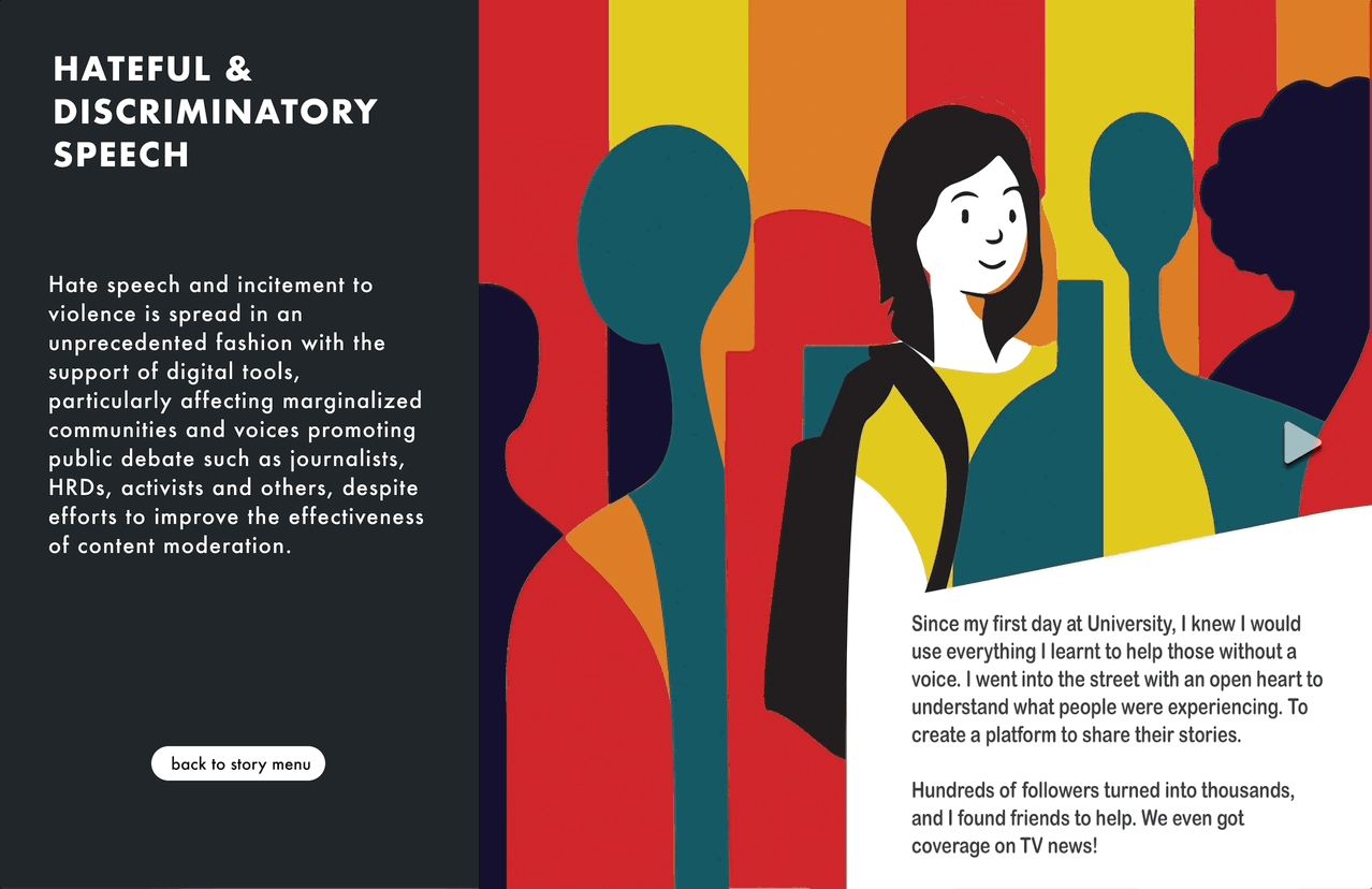
After meeting with the UN Bangkok office, we realized that human narratives were the most effective way to spark empathy, not just raise awareness. We decided to create six comic strips, each corresponding to one of the six key human rights trends identified in the report.
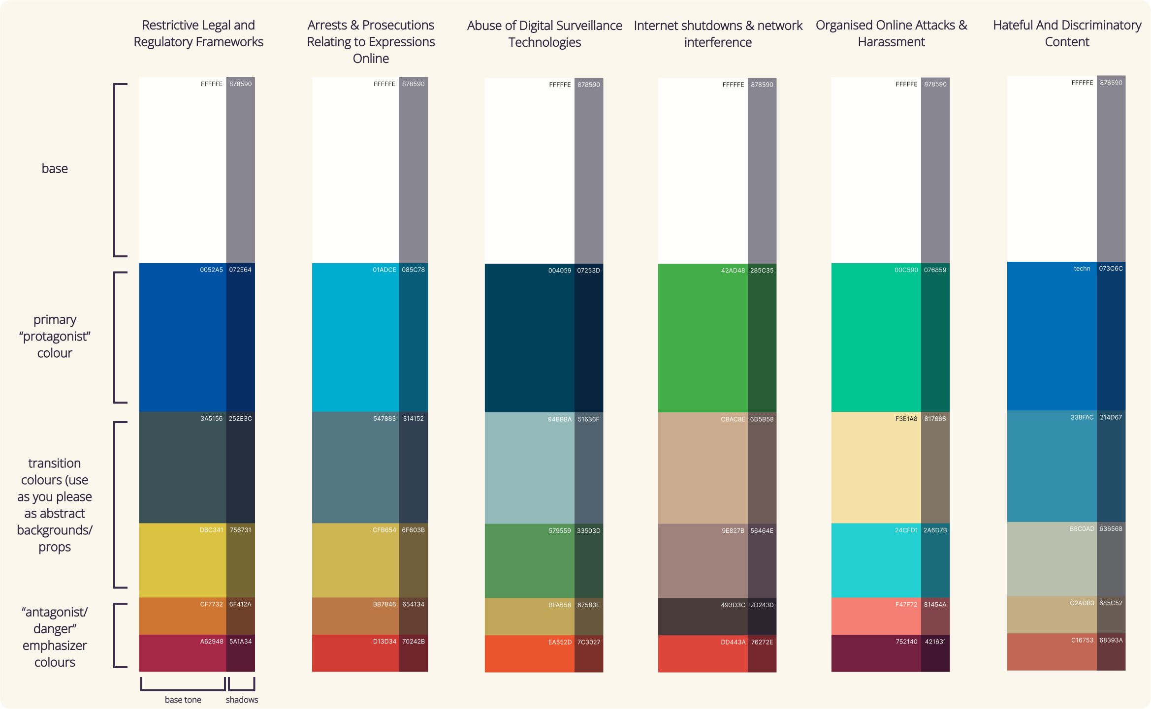
I Created Color Palettes for Each Comic
Click on the image to zoom in!
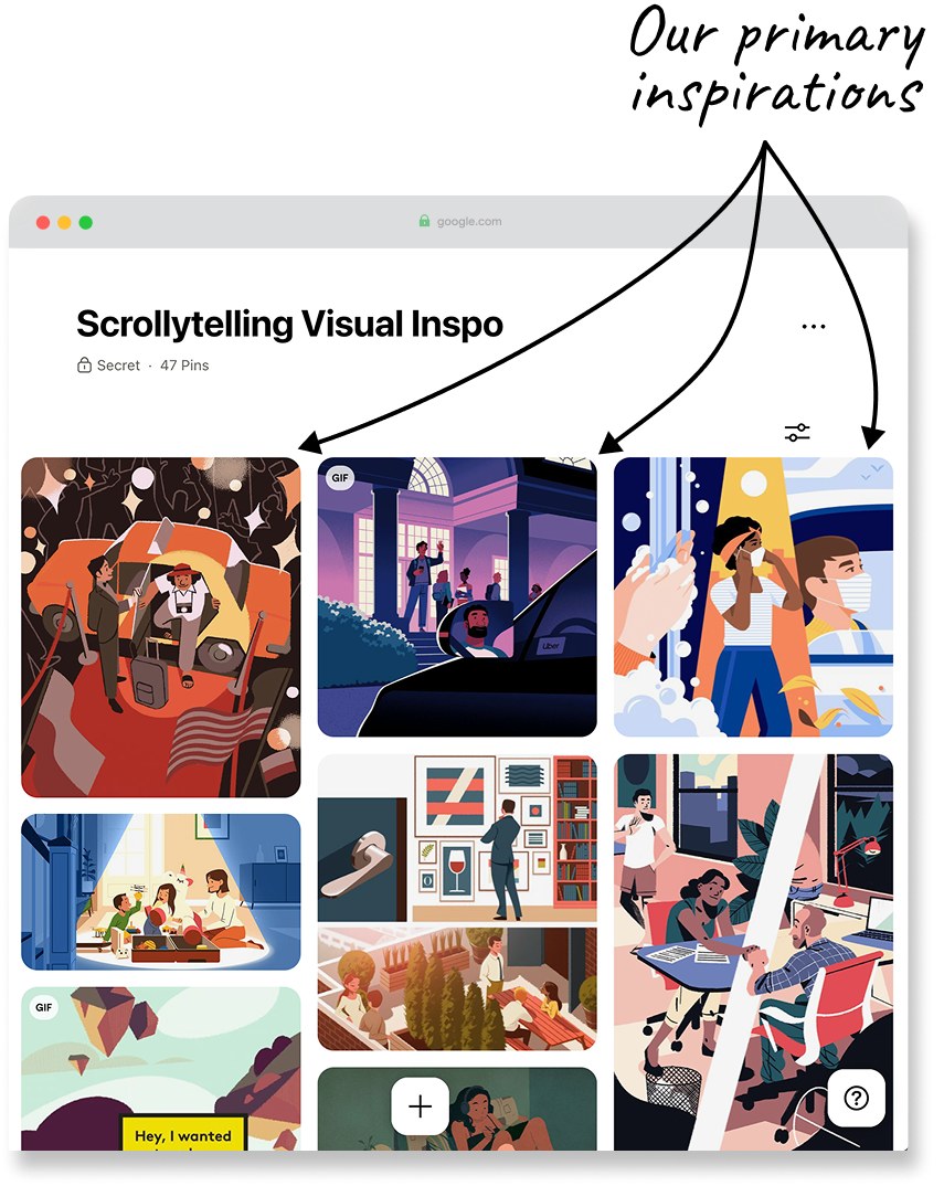
Visual Design Pinterest Board
I created a shared Pinterest board to align on tone and direction.
Ideating the Narrative Structure
Our writer & I co-developed story outlines for each of the six comic strips; one comic per human rights trend.
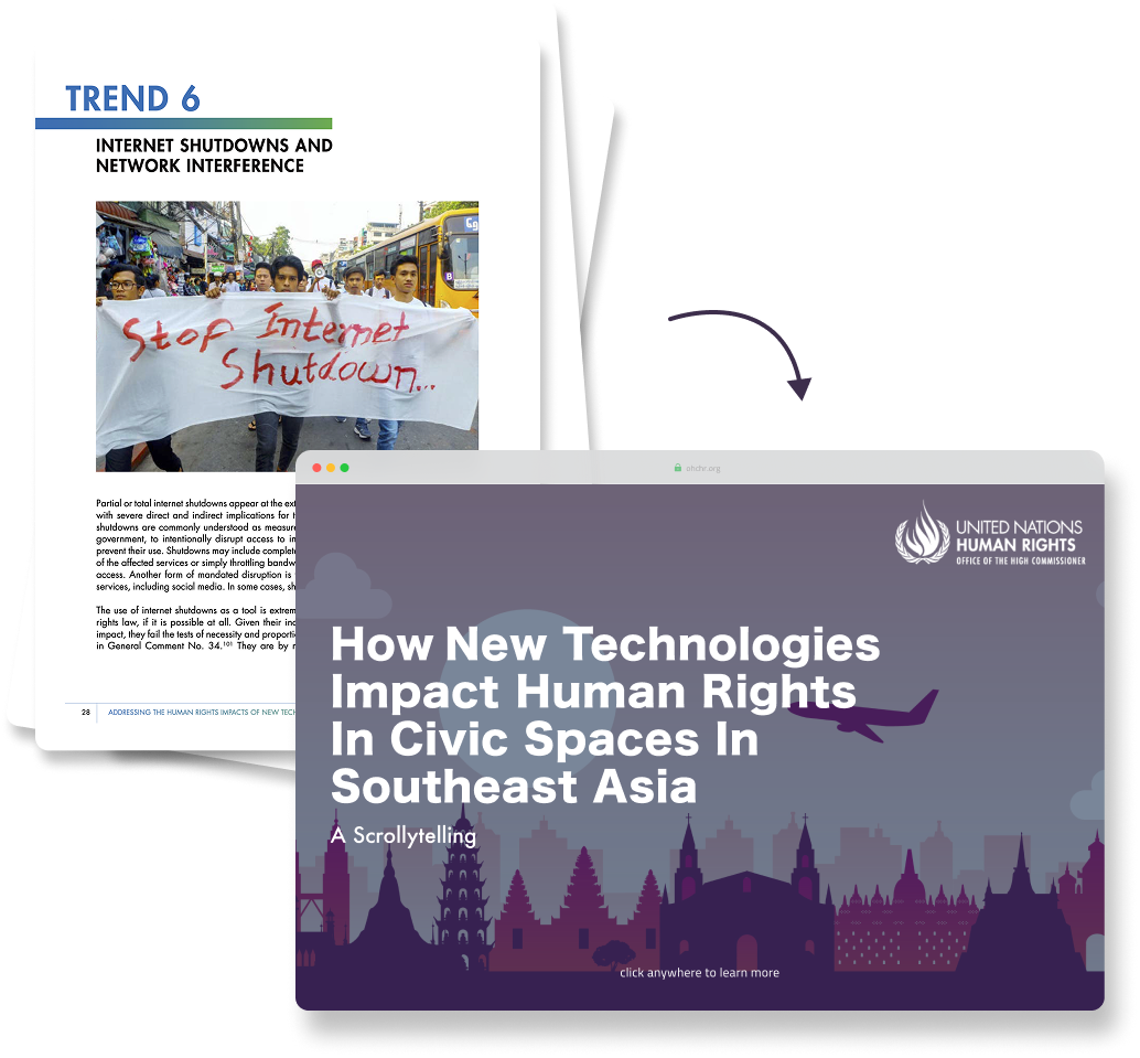
As seen in our pinterest board, I wanted a clean, lineless vector style that felt modern and vibrant while respecting the gravity of the subject. So our graphic designer created a prototype comic depicting a real human rights abuse. The prototype was well received by the UN. Paired with the UN’s signature blue, these became the foundation of the scrollytelling's visual identity.
Designing for Impact, Editing for Diplomacy
✦. ── Political Constraints Affecting Product Design
Our initial concepts were emotionally direct and visually bold. We wanted to call out systemic issues. However, client feedback made it clear that we needed to avoid portraying nations in a negative light. The concern was that such framing could be interpreted as the UN unfairly criticizing Southeast Asian countries, potentially straining diplomatic relations. For instance, the UN flagged my original landing page as potentially problematic:

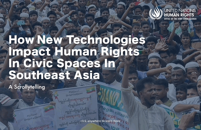
The Landing Screen BEFORE Diplomatic Sensitivity Edits
Name-dropping countries could be misinterpreted as the UN criticising Southeast Asian member states without basis
I removed any references in the interface & comic design to specific countries or governments. We edited both narrative tone and interface elements to be geographically neutral. The result was a story-driven experience that addressed regional issues without violating the UN’s diplomatic boundaries.
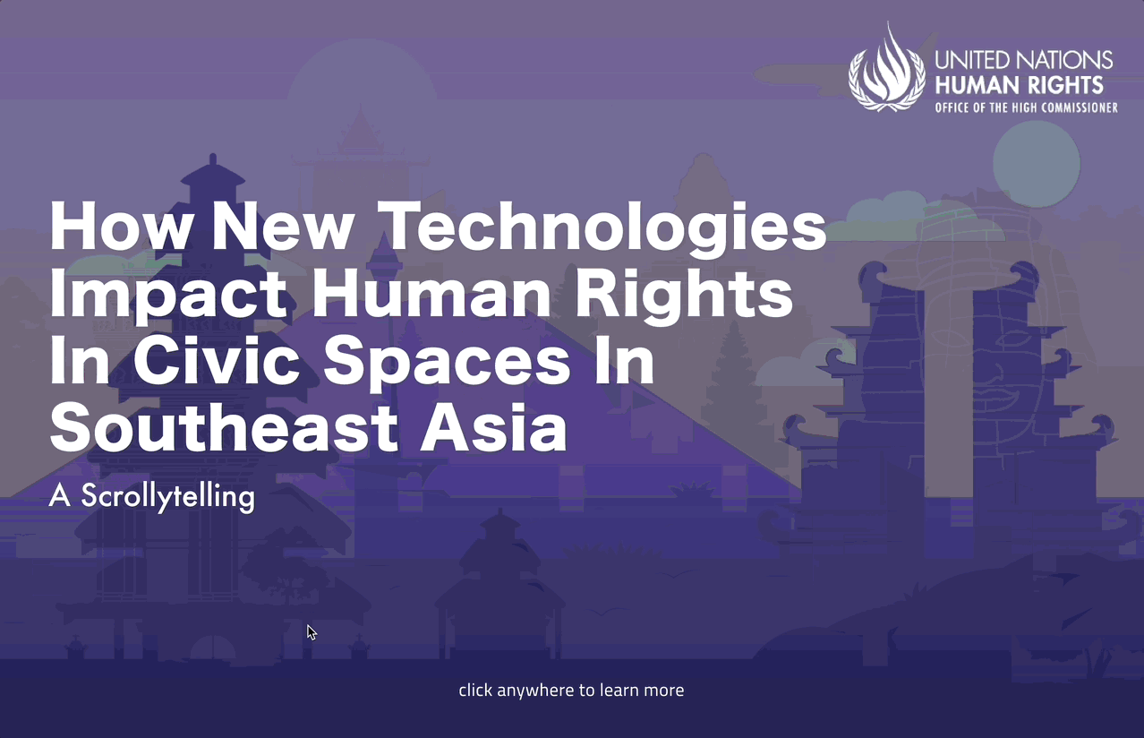
The Landing Screen AFTER Diplomatic Sensitivity Edits
I refocused the content on key human rights issues highlighted in the report, ensuring any references to human rights abuses were grounded in well-substantiated evidence.
Flashy Isn’t Necessarily Accessible
✦. ── Designing for Slow Phones & Small Screens
My first few iterations of the UI prototype leaned into rich, animated transitions—designed to be visually immersive and emotionally engaging. It felt more like an interactive art piece than a traditional report.
But after discussions with my design mentor and considering our audience, I had to make a critical design choice:
prioritize engagement, or prioritize accessibility. A substantial portion Southeast Asian youth access the web through lower-end devices, often with inconsistent internet connections [
2,
3]. Complex animations risked excluding the very users we aimed to reach.

Before
Artful, but excluded lower-cost devices
I responded by simplifying transitions, reducing animation weight, and adopting a responsive, mobile-compatible layout—ensuring the experience remained accessible across devices and connection speeds. This process taught me that accessibility isn’t just about disability. It’s also about economic access. Good design reaches people where they are.
After
More responsive and accessible on lower-cost devices
I brought up to my team that
mobile phones are more commonly used than laptops in the region, so we should optimize for mobile consumption [
4]. That said, scrollytelling is typically designed for desktop (hence accesed via the web and not an app). My developer and I briefly considered separate interfaces, but chose a
single, responsive system to reduce complexity and long-term development debt. I collaborated closely with my developer to adjust layouts and interactions in real time for mobile breakpoints—including getting to implement some of the mobile interface myself!
Product vs. Political Autonomy
✦. ── Final Client Feedback
After the first iteration, the UN OHCHR requested stronger neutrality, asking us to remove nearly all potentially negative references to Southeast Asian countries, even the subtle ones. The design needed to present the issues in general terms, without implying that any specific nation was responsible for particular human rights violations. I made last minute changes accordingly to the UI prototype before my internship concluded.
For me, this highlighted the limits of advocacy design within diplomatic frameworks. As designers, our role was to inform and inspire while carefully respecting political boundaries and national sovereignty.
Final Scrollytelling Userflow
Click on the image to watch the walk-through!
Did I Unite The Nations?
✦. ── What I Learned
No, I didn’t unite the nations. But that wasn’t the goal. This project taught me how to balance emotional storytelling with political sensitivity, much like balancing user needs with business goals in the private sector.
Product design is a balancing act. This project was a real-world lesson in restraint, clarity, and the power of UX to support public engagement, especially when direct action isn’t an option. Designing for advocacy means designing for impact, even if the message has to speak a little bit less loudly.