UBC MEDICINE – CLINICAL LEARNING TOOLS

Redesigning Tools That Actually Help Future Doctors Learn

Client
UBC Medicine
Industry
Education, Medicine
My Role
UX Intern
Timeline
Sep 2023 - Apr 2024
Tools
Figma, Nvivo, Oracle APEX
Team
2 UX Designers,
1 Instructional Designer,
4 Developers
For The University of British Columbia's (UBC)'s Medicine faculty, I set out to modernize three broken parts of the clinical education pipeline: a legacy ECG quiz app, frustrating skill assessment tools, and a curriculum that made nobody want to be a dermatologist. As the UX intern, I worked across user research, information architecture, and high-fidelity prototyping to bring clarity, fairness, and usability into medical learning.
✦ .  ⁺   . ✦ .  ⁺   . ✦
Redesigning UBC’s & NYU’s Electrocardiogram Virtual Tutor Without Reinventing the Wheel
Project #1: Migrating NYU’s Electrocardiogram Tutor to UBC Medicine
UBC medical students had long used an quiz platform developed by New York University (NYU) to test how well they can make diagnoses from reading Electrocardiograms (ECGs). This is a core skill to work in healthcare. But NYU is deprecating their tool. With over 12,000 ECG images in circulation, UBC wanted to develop its own in-house version, tailored to UBC's medical curricula.
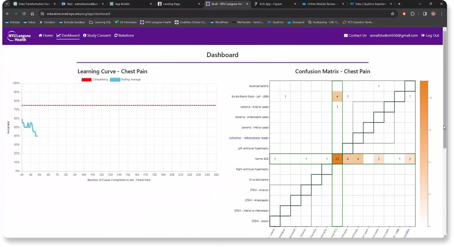
The foundational testing functionality had been built, but the tool wasn’t yet ready for deployment. My role focused on designing the instructor-facing features that would allow faculty to upload, organize, and manage custom quizzes.

Turning Requirements Into Real Use Cases

✦. ── Pre-Design Analysis
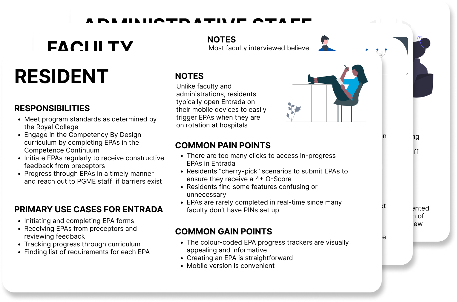
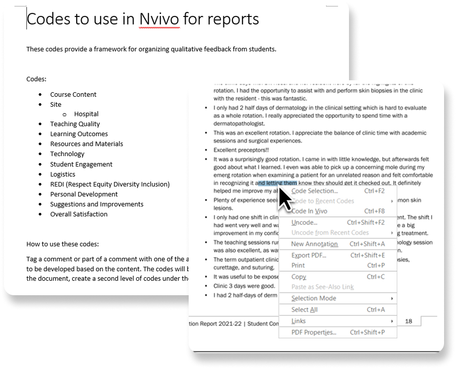
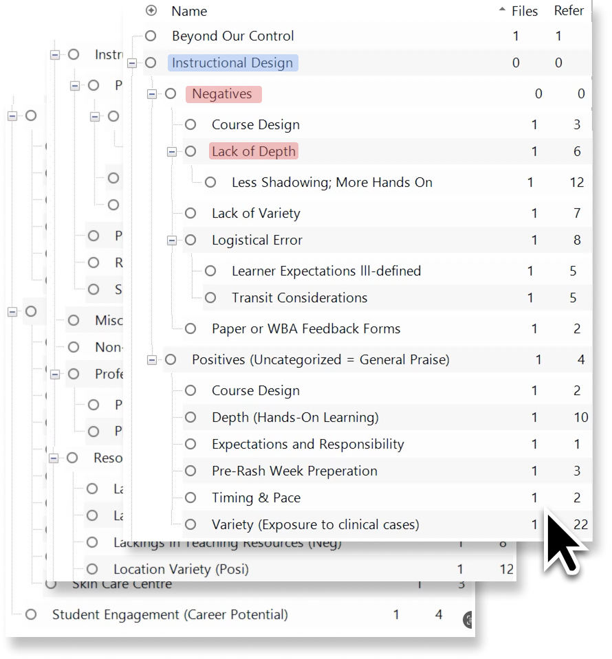
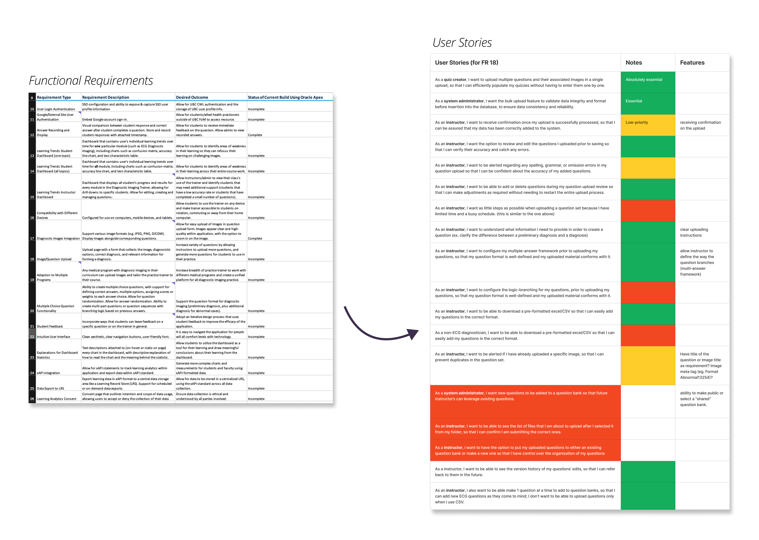
We received a list of functional requirements from UBC Medicine faculty. Most of the requirements had not been met in the current version of the virtual tutor. To clarify priorities and align design with real needs, I led my team to translate these requirements into user stories based on actual usage contexts. In doing so, we identified three core user groups: Faculty, Admin, and Students. Each user story applies to one of these three demographics.
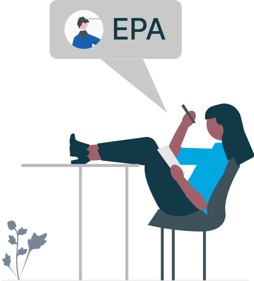
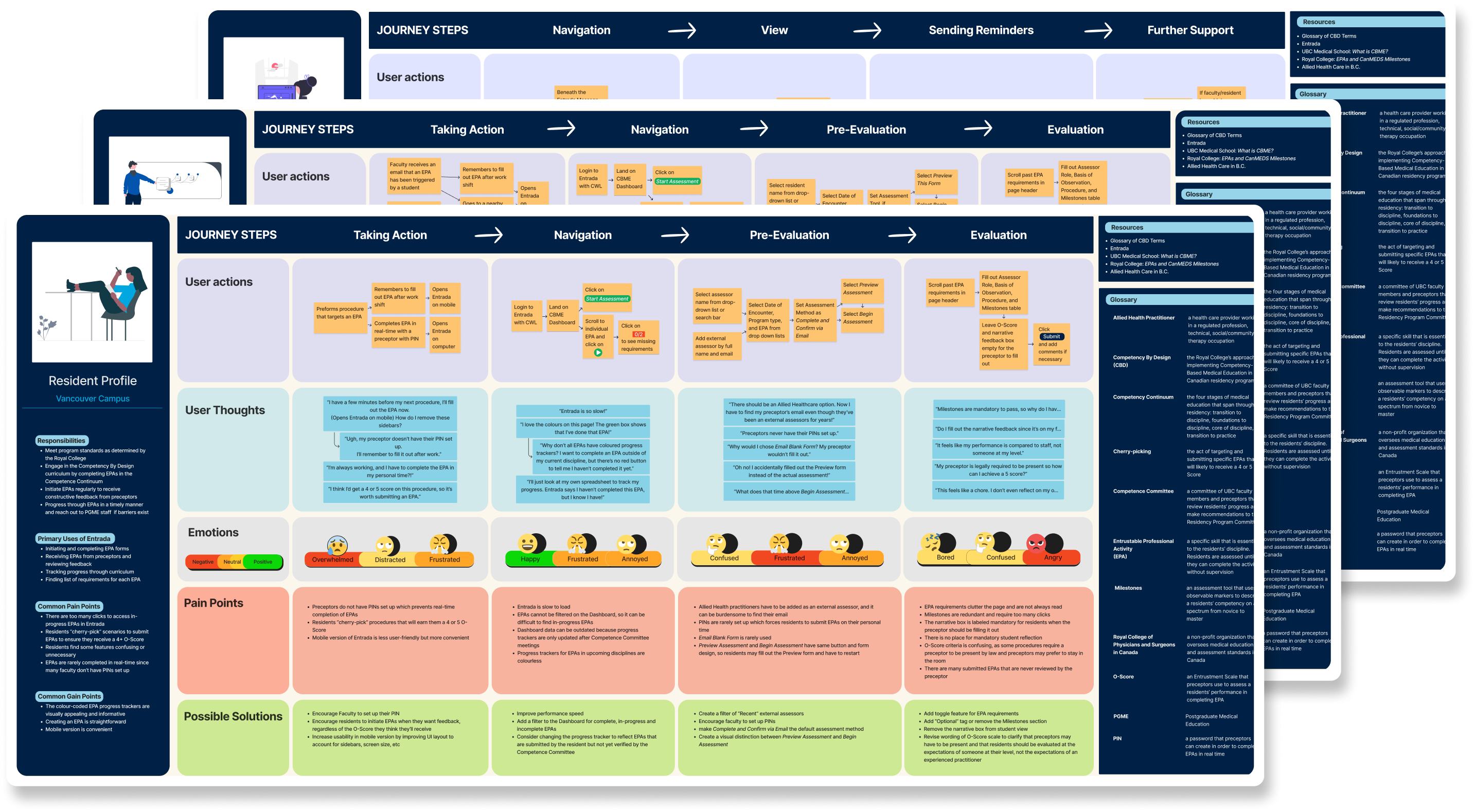
After reviewing and prioritizing features, we focused on one critical gap: the ability for course staff to create and manage custom ECG quizzes. Previously, UBC faculty used quizzes hosted on NYU’s platform, developed in collaboration with UBC but maintained only by NYU. Now that the tool was being brought in-house, we needed to design a new workflow that allowed instructors & course staff to generate and tailor quizzes to their specific courses and cohorts; something they had never been able to do before.

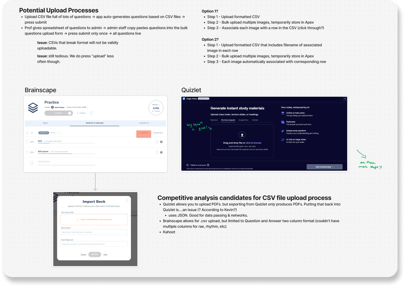
Borrowing from Quizlet (Because It Works)

✦. ── Analyzing Competitor Tools in the Private-Sector
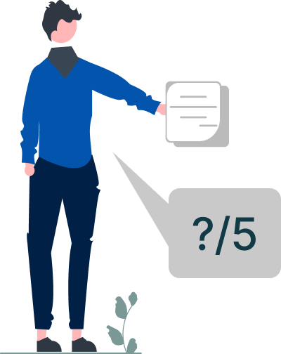
We reviewed early user research (conducted prior to my role) on how medical students tend to study outside of using the original ECG platform. The findings showed that Quizlet was the most frequently used tool. Our data shows that it was also widely recognized amongst faculty and staff. So rather than reinventing a new interaction model, I leaned into users’ existing mental models.
By referencing Quizlet’s familiar card-based structure and quiz flow, I was able to mirror an interface that students already knew how to use. This reduces onboarding time and cognitive load. Adopting familiar interaction patterns ensured a smoother transition and improved usability from day one.

Intentionally Making the UI “Ugly”

✦. ── High-Fidelity Prototyping
Early user research (conducted before I joined) revealed that while students and faculty didn’t find the NYU interface visually interesting, they valued its simplicity and familiarity. Our data archives, however, showed that our medical students recurrently expressed frustration when learning tools changed abruptly—especially mid-semester—due to the added cognitive load of relearning new systems during already demanding schedules.
Initially, I wanted to redesign the interface to be sleek and modern. But I came to understand that visual overhaul wasn’t the priority, minimizing friction was. No bells. No whistles. Just a tool that helps students resume ECG practice quickly and intuitively—even if that meant keeping the interface “ugly.”
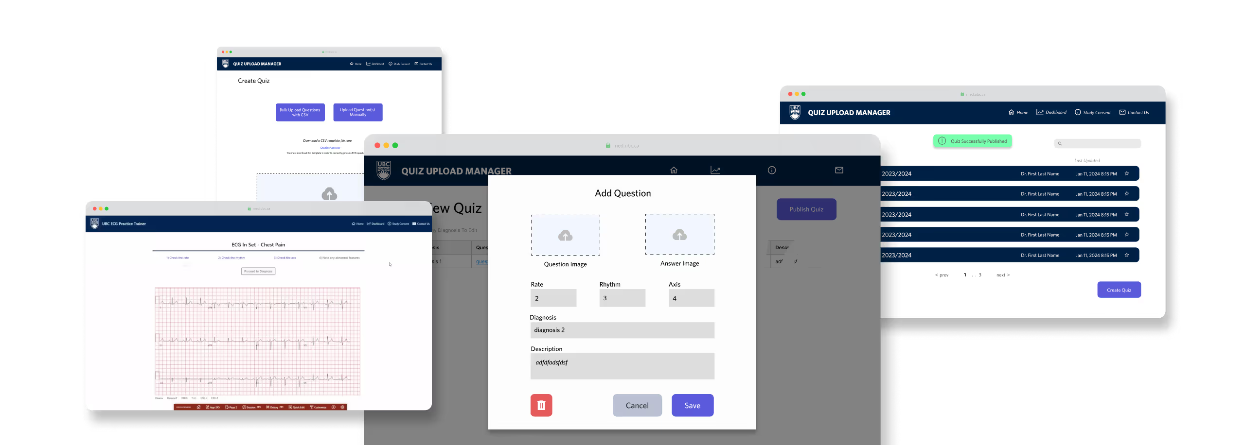
The team & I made a deliberate decision to keep the UI plain and closely aligned with NYU’s original design. The goal was to reduce disruption and enable a smooth transition to UBC’s in-house version.
I combined NYU’s visual structure with Quizlet-inspired workflows to support familiar interactions. This also aligned with UBC’s existing Oracle APEX system, simplifying backend integration for our developers.

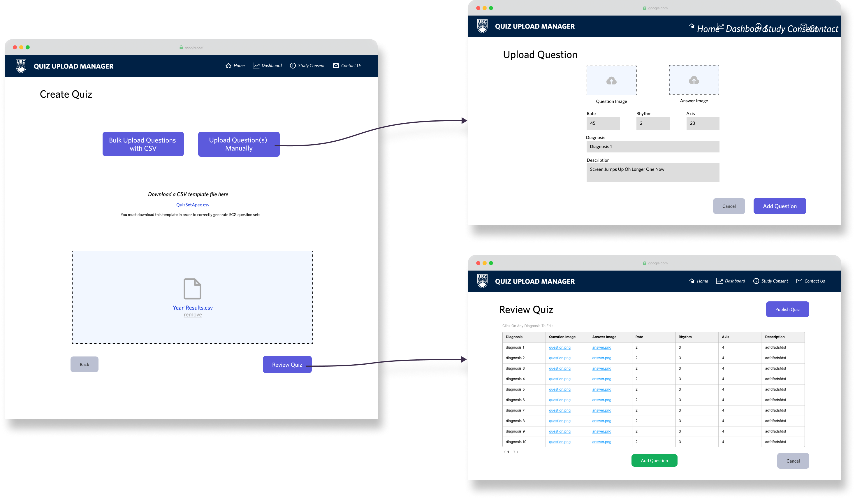
Final Design: Upload → Build → Practice

✦. ── Design Showcase
As my internship was coming to a close, I wrapped up this first iteration with a working upload-and-quiz builder flow. These designs were handed off to the next UX team to expand student-facing features.

Good-Looking Doesn’t Mean Good for Users

✦. ── What I Learned
  • Pretty doesn’t mean usable
    The clean and polished aesthetics typical of the private sector means nothing in a learning tool if it gets in the way of the actual task. At the end of the day, a good-looking prototype on Figma doesn’t necessarily mean good for our users.
  • Familiarity reduces friction
    We don’t always need to “innovate,” especially on visual design. We only should do so if it helps the user. We need to first consider users’ existing mental models on interactions in order to reduce friction!
  • Not Every Usability Issue Can Be Solved in Figma
    Some usability issues emerge only at the implementation stage. For example, Oracle APEX required uniquely named image files to avoid overwriting data—something most users wouldn’t think about. This limitation wasn’t fixable in the UI alone. I worked with developers to explore backend solutions, reinforcing that good UX often requires cross-functional thinking beyond just design mockups.
✦ .  ⁺   . ✦ .  ⁺   . ✦
9 out of 10 Hospital Residents Feel Their Assessments Aren't Fair
Project #2: A UX Research Analysis of Clinical Skill Evaluation
UBC Medicine uses Entrustable Professional Activities (EPAs) to assess residents on core clinical skills. EPA evaluations are logged through Entrada, a centralized academic platform used across medical schools in Canada. Entrada functions as both a learning management system and an assessment tool. This is similar to Canvas, but tailored for medical education. Previous UX research (done before my internship by senior members of my team) targeted three user groups:
  • Hospital Residents: Learners being assessed
  • Faculty: Clinical preceptors conducting evaluations
  • Program Administrators: Staff managing records and reports
I conducted a UX research analysis from 18 user interviews, conducted before I came onto the project, to better understand the EPA workflow. First, I created demographic overviews on our three user groups:

How EPAs Work

✦. ── Research to Understand Context
EPAs are short assessments, like digital “badges," that residents initiate after demonstrating a clinical skill. The process works like this:
In theory, this system supports real-time feedback and skill-based progression. In practice, it frequently breaks down.

Bad UX Is Blocking Canada's Future Doctors

✦. ── Journey Mapping Analysis Findings
We found that faculty often delay or skip assessments due to poor mobile usability, forgotten login credentials, or limited incentive to provide feedback. Hence, administrators are left chasing down incomplete entries and navigating a complex interface to maintain records. Because being able to get a faculty preceptor’s attention is so rare, residents tend to "cherry-pick" only strong performances to be evaluated, skewing data. As a result, many users across all three groups felt the process was unfair, inconsistent, and ineffective as a learning tool.
The underlying issue wasn’t just UI complexity, it was systemic friction. EPA logging became performative “badge collection” rather than a reflection of clinical learning. Without more usable tools and better feedback mechanisms, both faculty and residents felt disincentivized to treat the process as meaningful.
Per user group, I, alongside another intern, translated our findings into journey maps to visualize where and how the EPA process failed for them:

Paving the Way to a Stronger Medical Curriculum

✦. ── Post-Internship Impact
My research was delivered to the department responsible for overseeing Entrada integrations. While I wasn’t directly involved in the redesign (as Entrada is managed by a third-party team), my findings were used as evidence to support internal advocacy for curriculum changes.
✦ .  ⁺   . ✦ .  ⁺   . ✦
Nobody Wants to Be a Dermatologist (and Why That Might Be UBC’s Fault)
Project #3: Sentiment Analysis on UBC Medicine’s Dermatology Curriculum
UBC Medicine’s “Rash Week” is a 5-day intensive dermatology module designed to introduce students to dermatological concepts and clinical cases. Students are placed into dermatology clinics around British Columbia to be mentored by a dermatologist, acting as a preceptor.
However, qualitative feedback from students consistently reflected disengagement and dissatisfaction, raising concerns about the curriculum’s impact on student interest in dermatology. To investigate further, I conducted a sentiment analysis on open-ended student feedback, using NVivo to code, categorize, and synthesize key themes.

Identifying Root Themes in Student Feedback

✦. ──Thematic Analysis Methodology
I followed a deductive coding process, I began with an initial set of topic-based codes provided by a senior researcher, refining and expanding them iteratively as I coded more responses.
Each student comment was first sorted by topic, then categorized by positive or negative sentiment.
I then introduced sub-codes to capture why students felt positively or negatively about each topic. For example, “lack of depth” was a negative sentiment sub-code under the broader category of "Instructional Design.”
I grouped recurring themes into affinity clusters to identify key friction points in the Rash Week experience. The root issue was poor logistical planning, which led to a lack of structure across clinics. This resulted in limited learning opportunities and inconsistent preceptor engagement.
Despite strong initial interest in dermatology, students were met with disorganized rotations and unprepared clinics. Many dermatological preceptors, already overwhelmed, were unable to provide meaningful guidance. As a result, Rash Week actively discouraged further interest in the specialty.

Healing the Rash: Impact to Curriculum

✦. ── What I Learned
Using on my report, UBC Medicine faculty initiated a full review of the Rash Week curriculum. My analysis was used as evidence in Rash Week's curriculum amendment proposal.
This project taught me the value of sentiment analysis as a UX research method—not just for interfaces, but for designing educational systems. Curriculum, like UI, is a product that must be shaped by user feedback. UX doesn't stop in Figma. It extends to the structure of learning itself.
✦ .  ⁺   . ✦ .  ⁺   . ✦