Giving Users Time to Think, Not Just Click
✦. ── Designing 2D Physical Exam Interactions
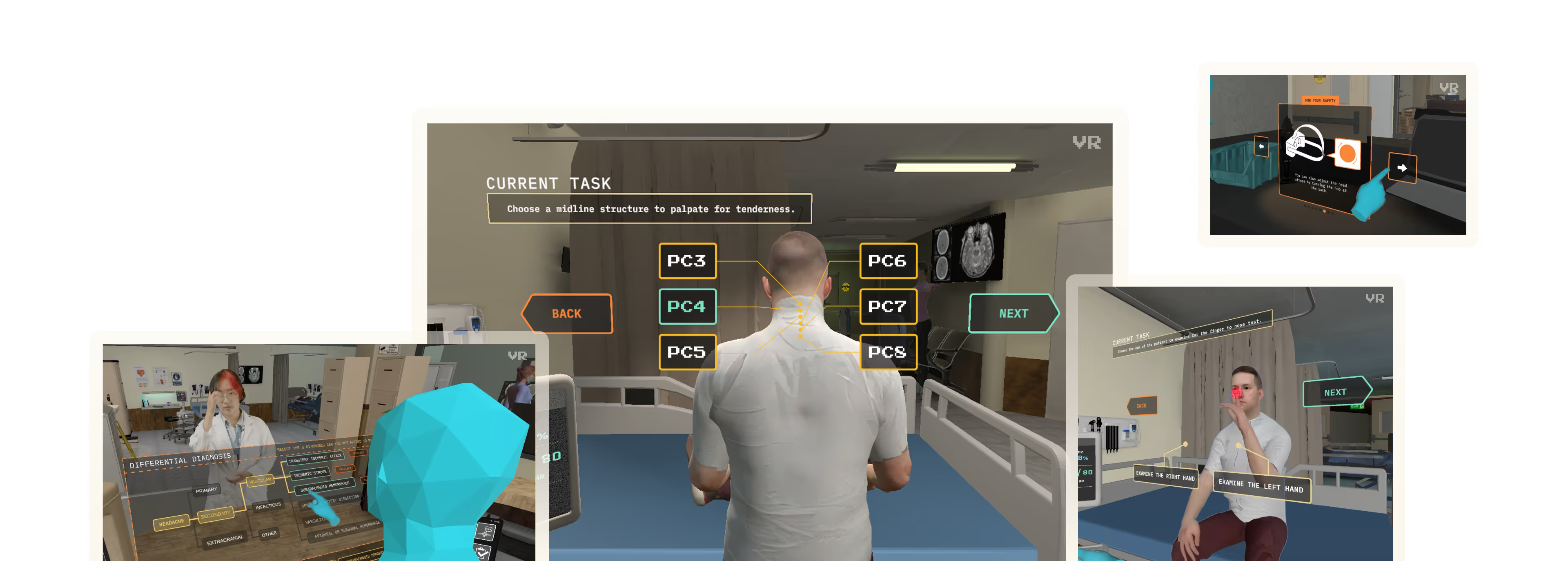
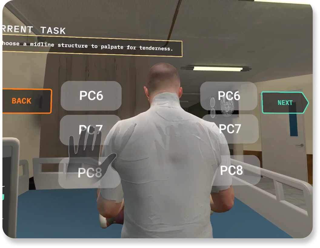
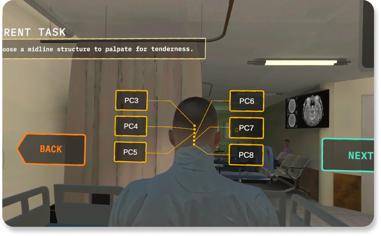
I designed the interface for the neck exam: a neurological test within ICE where students must identify the cervical (PC) bone that triggers an atypical pain response in the virtual patient. Before, ICE had simplistic button for the neck exam:
Before My Changes
as viewed in-headset
After My Changes
Live in-game, as viewed in-headset
Labels were paired with anatomically accurate indicators to reinforce clinical reasoning. After selecting a bone and clicking , the student simulates palpation, triggering an audio cue that reflects the patient's level of discomfort. The goal is to help students learn to diagnose through observation, not guesswork.
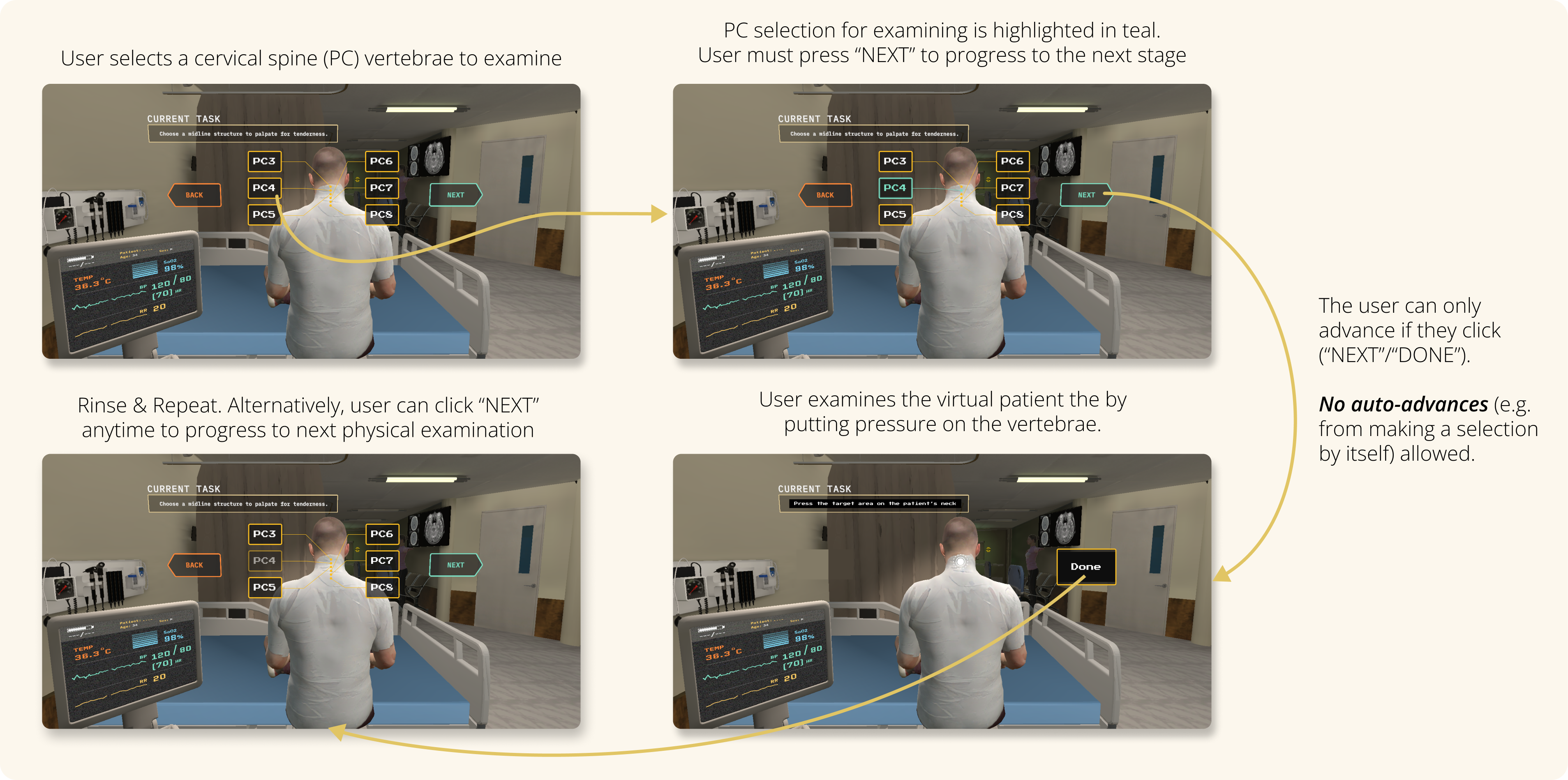
Neck Exam User Flow
as prototyped on Figma
The interface prevents accidental progression. Students must manually confirm their choice before continuing. I purposefully designed this interaction to support critical thinking over speed. Rather than pushing users forward automatically, the design gives them space to explore, reconsider, and validate their decision. This interaction reinforces that in medicine, accuracy matters more than speed. Reducing friction here doesn’t mean rushing users. It means clearing the path so they can focus.
Reducing Cognitive Load in Assessment
✦. ── Quiz Interface & Implementation
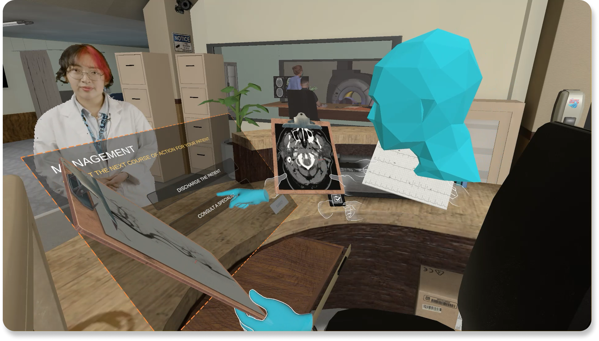
Following the exam phase, students enter a quiz to confirm their diagnosis and determine the correct referral pathway (e.g., neurology vs. cardiology). Given the added sensory load of VR, I focused on simplifying interaction and without sacrificing thoughtfulness. Key UI improvements included:
Reducing clicks required to progress
Applying the same teal-green highlight to show current selections
Preserving the option to revise choices before final submission
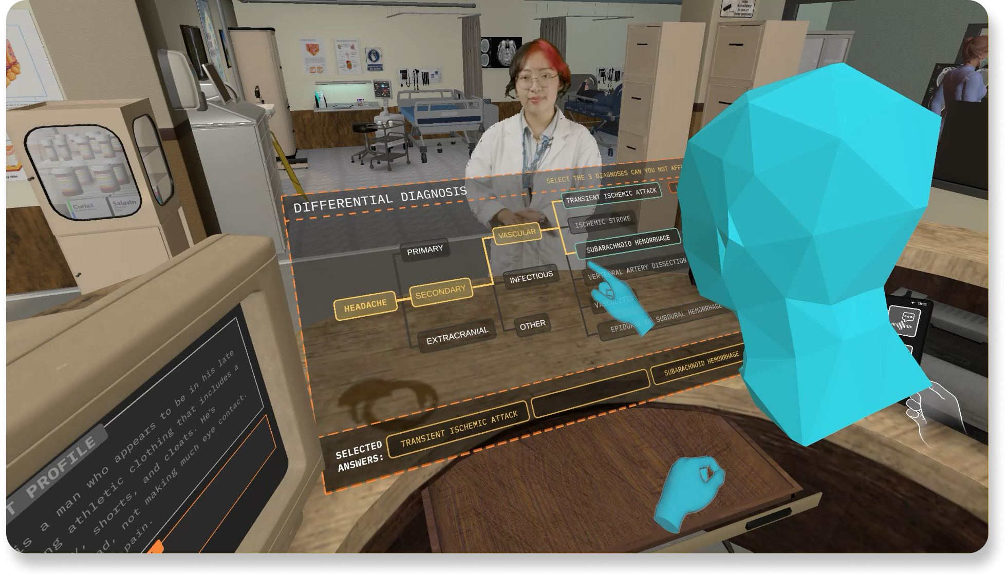
Differential Diagnosis Quiz
as viewed in Spectator Mode
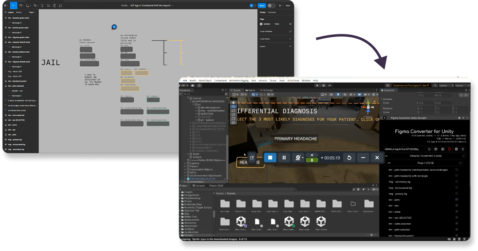
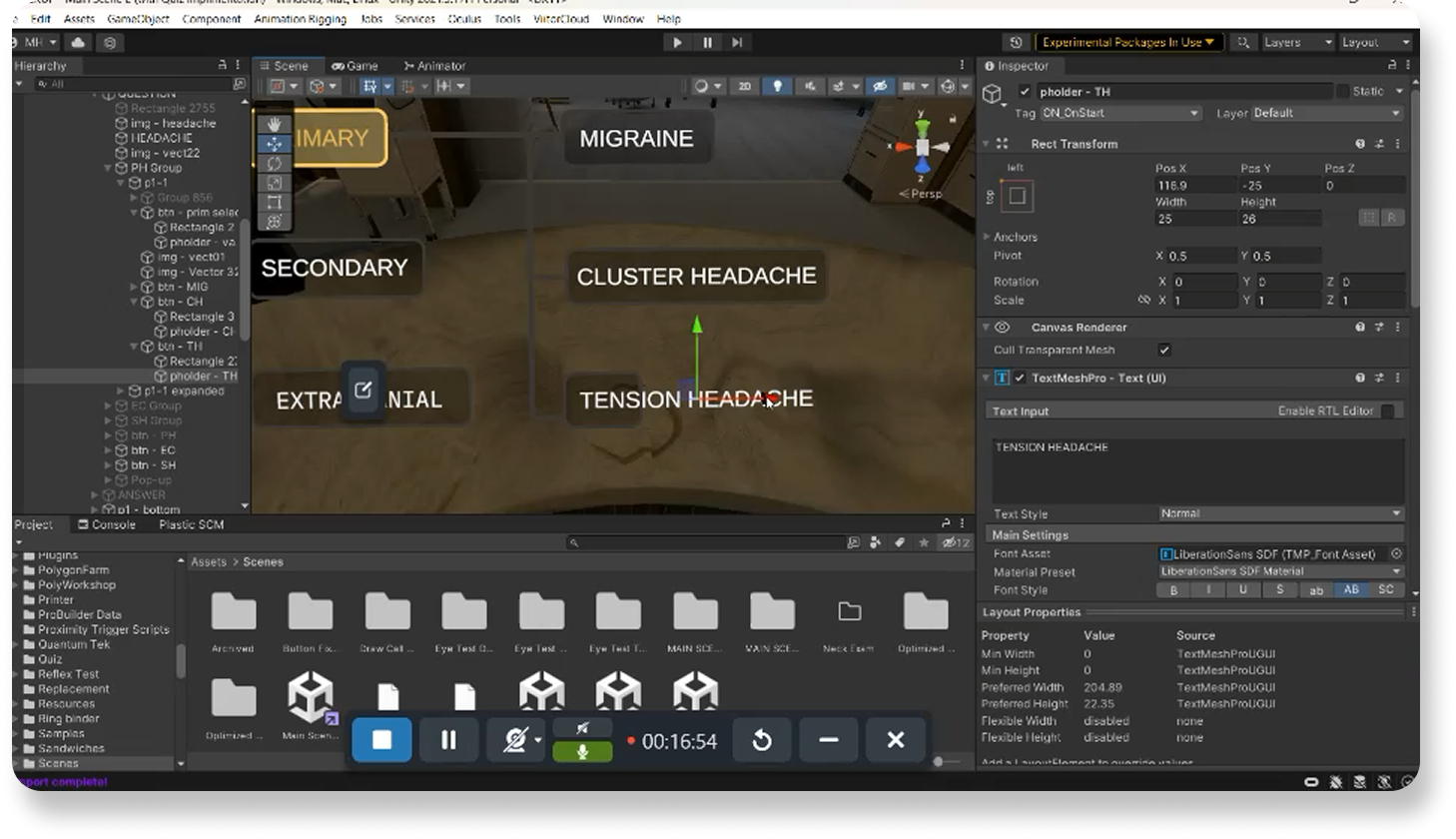
My developer experience came in handy here, as I then implemented the interface directly in Unity in order ensure users’ interaction aligned to my vision
I imported 2D assets and refined the assets’ interaction logic & button placement in the 3D space.
I adjusted spatial positioning and hitboxes to reduce physical effort in VR. I ensured the layout was optimized for visibility and comfort in-headset. Students no longer have to strain or reach forward to interact with the game.
Being able to implement and test my designs in Unity (C#) allowed me to refine the interaction from both design and development perspectives. In VR, UX isn't just about prototypes on Figma; it's about how users move, reach, and think within a 3D space. The difference of a few pixels can shift the entire experience.
Implementing My Own Designs Into Unity
✦. ── Illustrating Visual Disclaimers & Safety Messaging
To prepare users for sensory load and safety before they can even enter the simulation, I redesigned ICE’s onboarding disclaimers. Previously, these disclaimers were plain text and often ignored. So I illustrated 2D graphics that clearly communicated safety guidance at a glance to go with my interface redesigns.
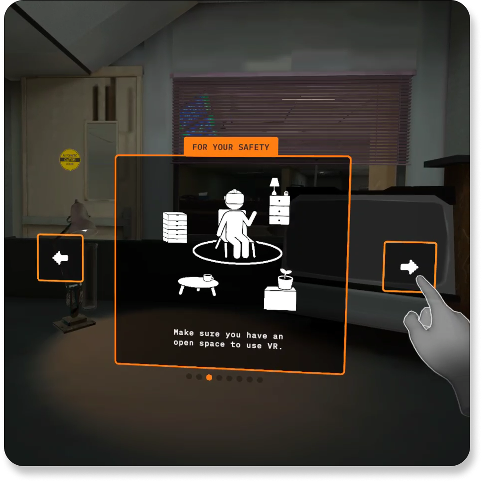
A Disclaimer I Designed, Live In-Game
as viewed in a VR Headset
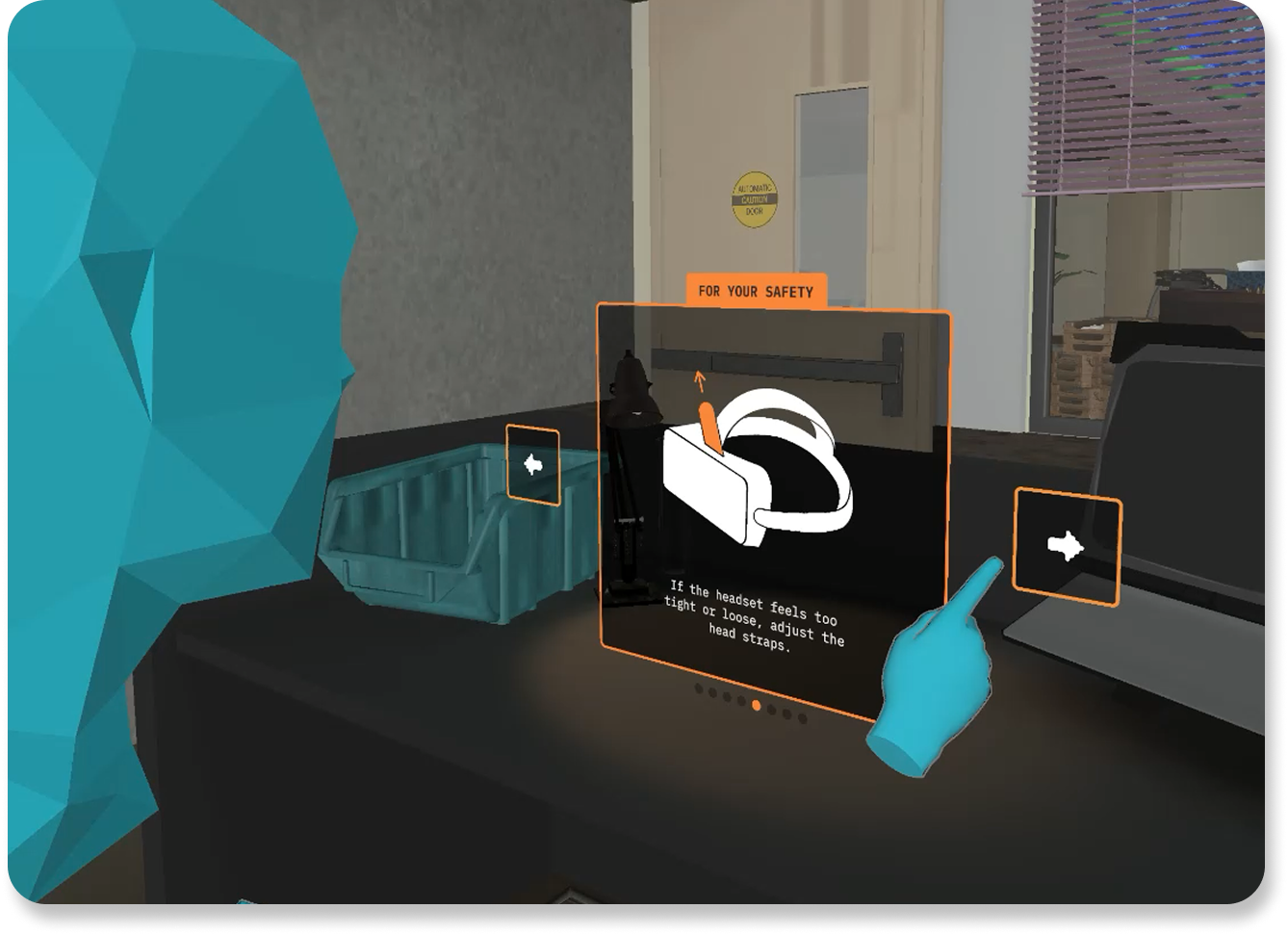
A Disclaimer I Designed, Live In-Game
as viewed in Spectator Mode
Due to time constraints of the project, I created the visuals in Procreate as pixel-based PNG graphics (opposed to vector-based graphics), prioritizing speed over perfect scalability. I then imported and implemented these directly in Unity. I could hence control their exact spatial placement, aspect ratio, and hitbox logic to ensure visibility and ease of interaction in-headset with minimal back-and-forth with our VR developers.
Getting to implement my own designs reinforced how visual design intersects with technical delivery. Quality isn’t just about aesthetics; it’s about legibility and performance.
Making Learning Analytics Speak for Themselves
✦. ── Designing the First Diagnostic Performance Feedback Panel
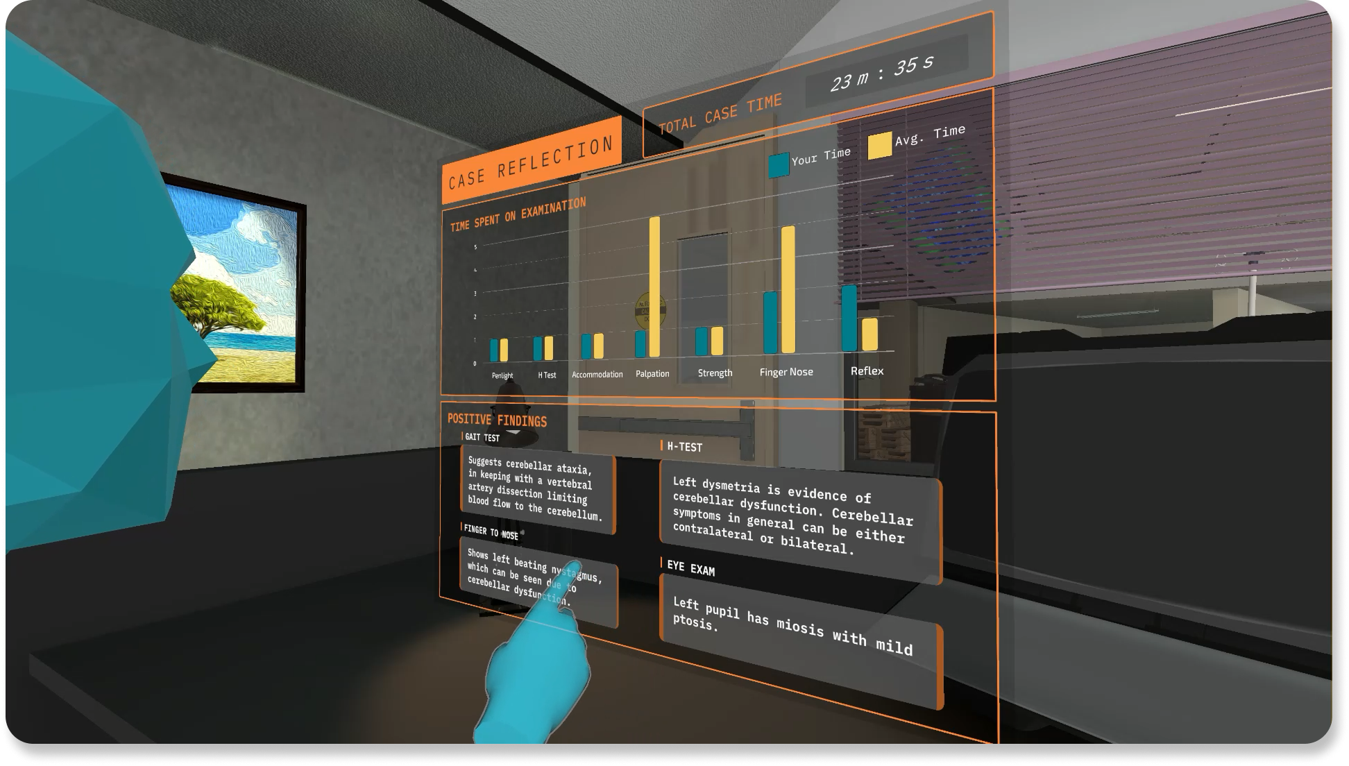
I was assigned to explore how to visualize student performance after completing the diagnostic flow. This would be the first iteration of a learning analytic dashboard in ICE's history, ever! In my first design, I used a pie chart to show time spent on each physical exam section, and a “tap to reveal” feature to display expected clinical findings.
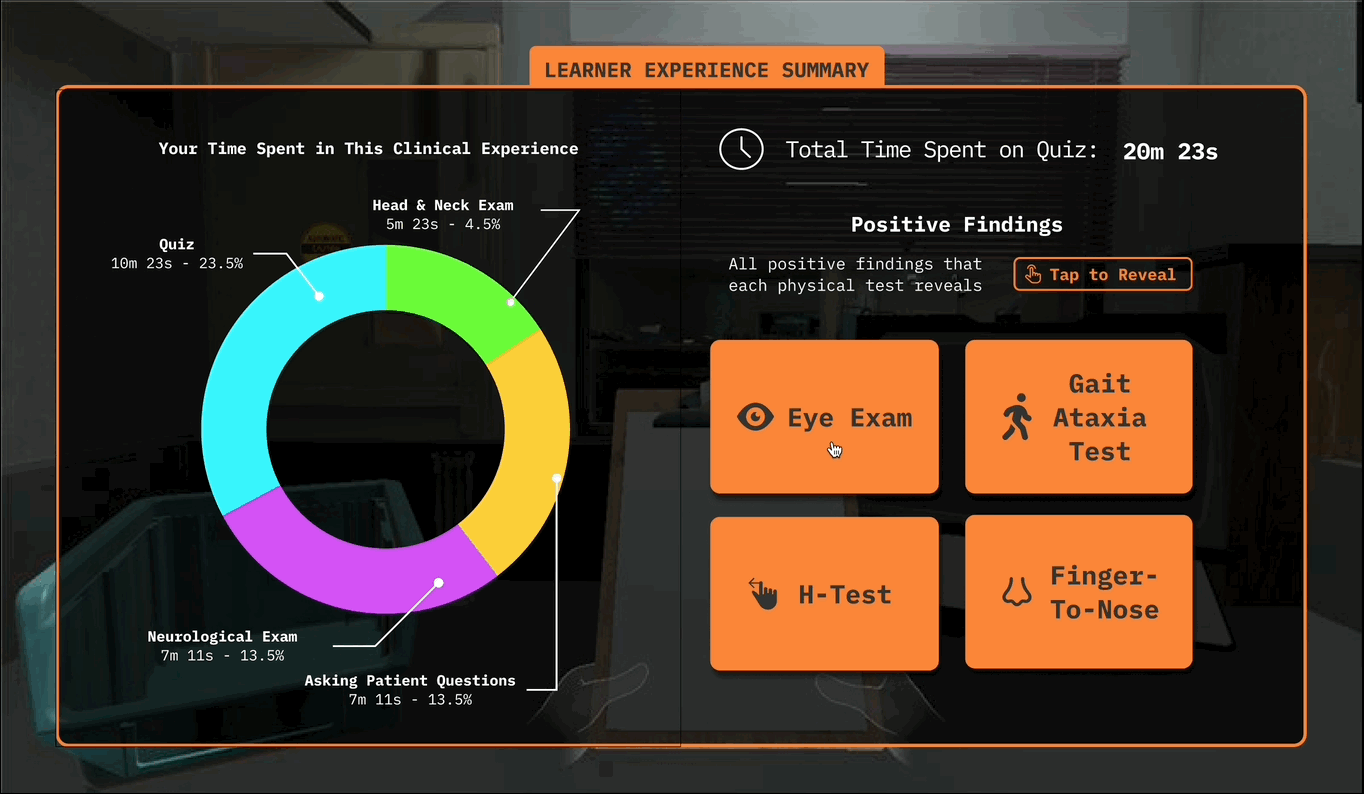
My First Iteration of Learning Analytics Dashboard
After team deliberation, I realized it's TERRIBLE!
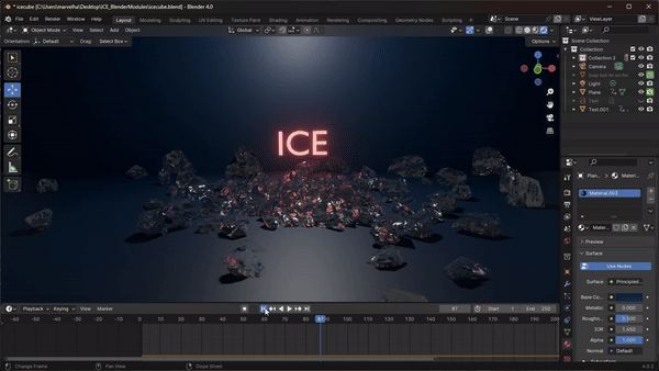
I designed ICE’s animated intro using Blender. I made an animated ice cube concept that plays on the acronym of “ICE”. The goal was to create a unique and engaging onboarding moment to help students remember the experience long-term. When students come into their real-life clinical rotations, we want them to think to themselves “I’ve done this before, in ICE.”
The concept was praised for visual appeal by the project producers. They especially enjoyed the "ICE cube" pun being made here. But the animation proved difficult to implement. Our lead VR developer & I faced challenges importing it from Blender to Unity without crashing the game. This remained an ongoing technical issue even after my internship ended, which limited my ability to create more complex animations. With more time, I would have liked to further refine this sequence.
Working on ICE introduced me to core principles of game & VR design, as well as the technical realities of implementation. Key lessons include: